Overview
Klipit digitizes your receipts for a clutter-free, eco-friendly, and financially smart tomorrow. This case study displays the work of making the onboarding process seamless and revamping the application's flow.
The Workflow for revamping the design of the application is as follows:
1. Research
This step includes background research on the brand and its offerings. Furthermore, it takes into account the pain points of users to improve the app's functionality.
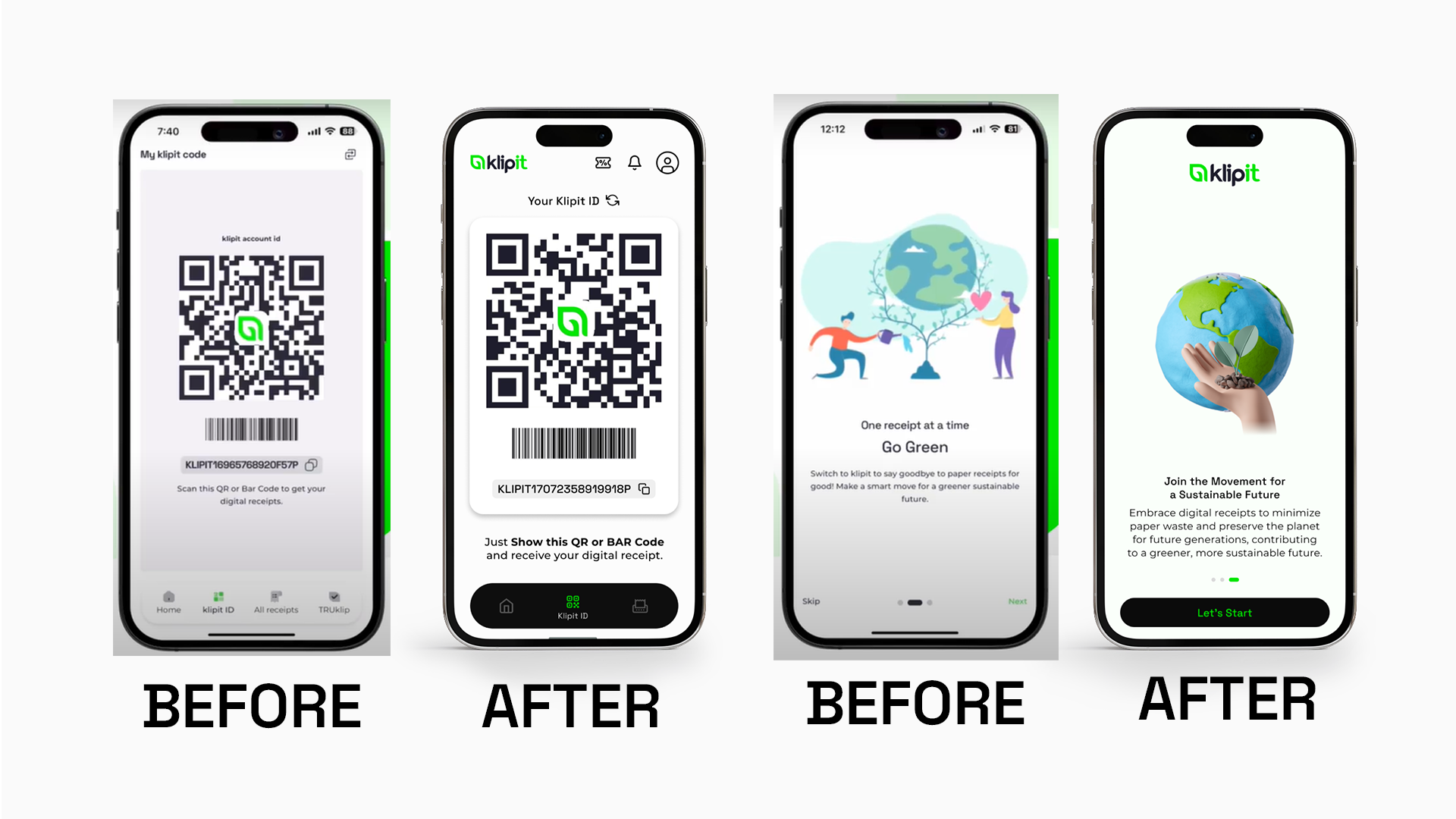
Pain points in the onboarding process
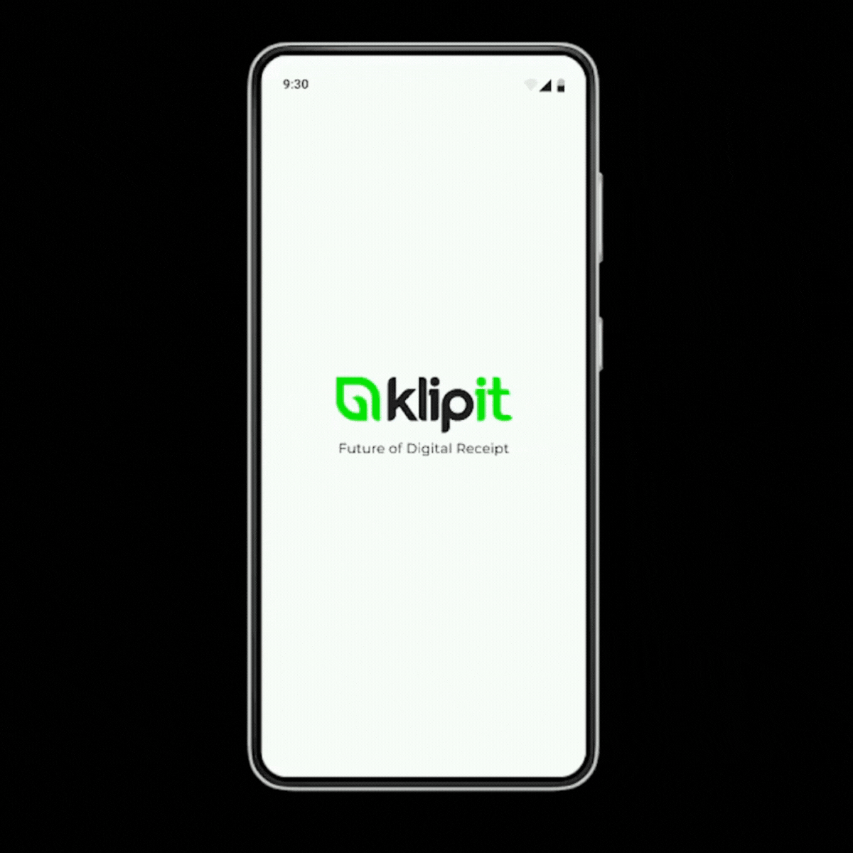
• The opening logo animation was missing the tagline. Hence, the existing onboarding screen did not communicate the function of the brand.
• The initial onboarding screens couldn’t convey the purpose of using the app efficiently.
Pain points on the Homepage
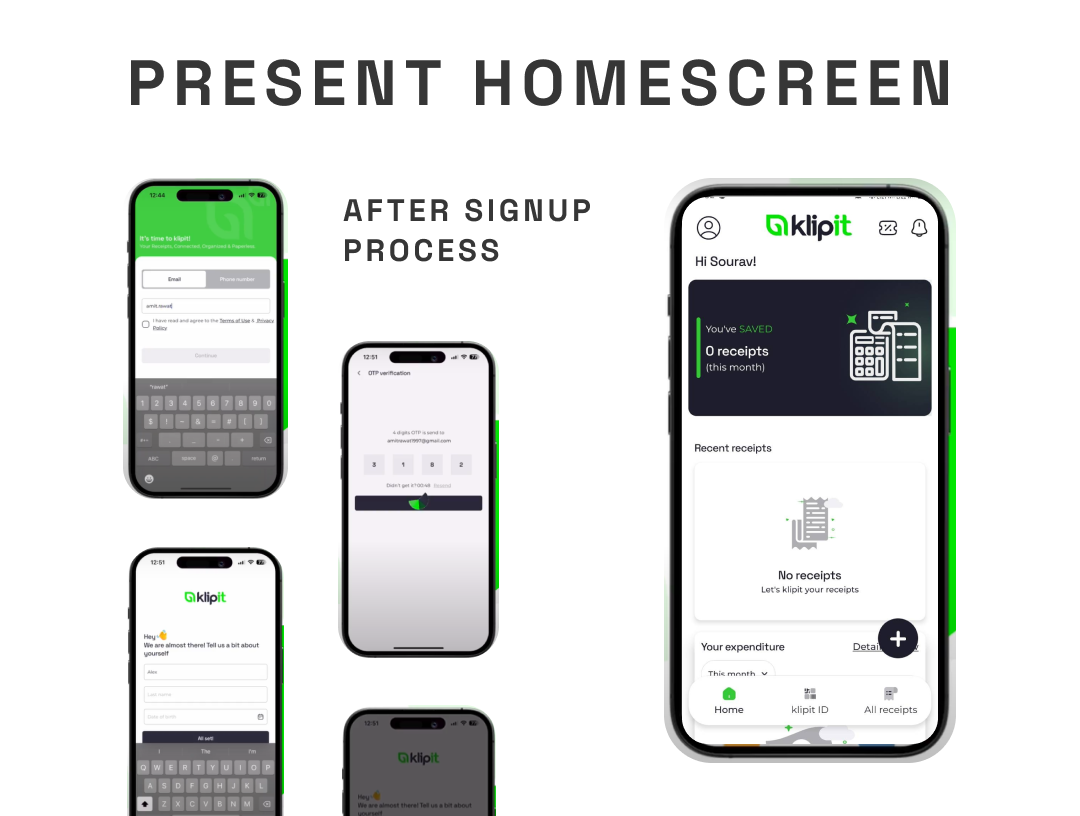
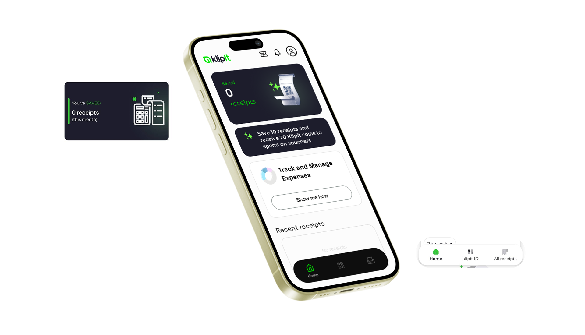
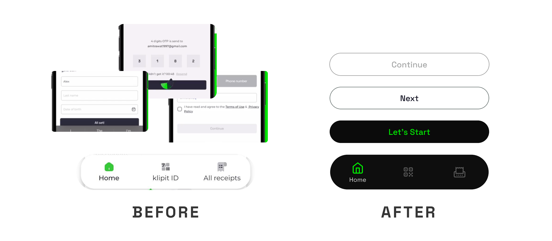
• After completing the signup process, the home screen displayed a load of textual information.
• There was no direction for a new user to follow, and no clarity on the action required.
2. Planning
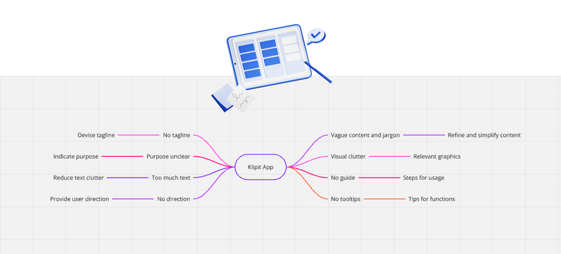
A plan was created to solve the functional problems found in research; based on a competitive study of similar functioning apps.
• Adding important missing elements and features
• Refining content by replacing jargon with simple words and clever choice of keywords
• Reducing visual clutter by making the graphics more relevant and impactful
• Including a guide for new users to make them acquainted with its functioning
• Placing tooltips on the home screen to help with new features
3. Design
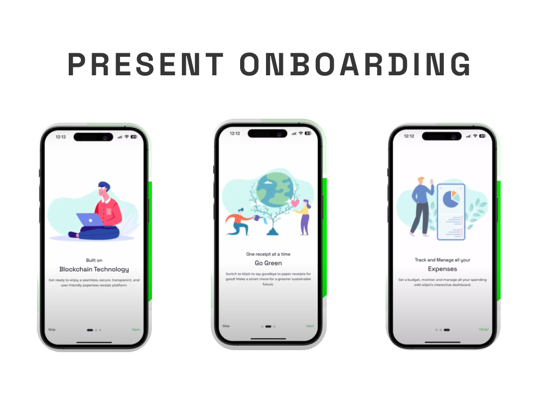
Initial rough sketches
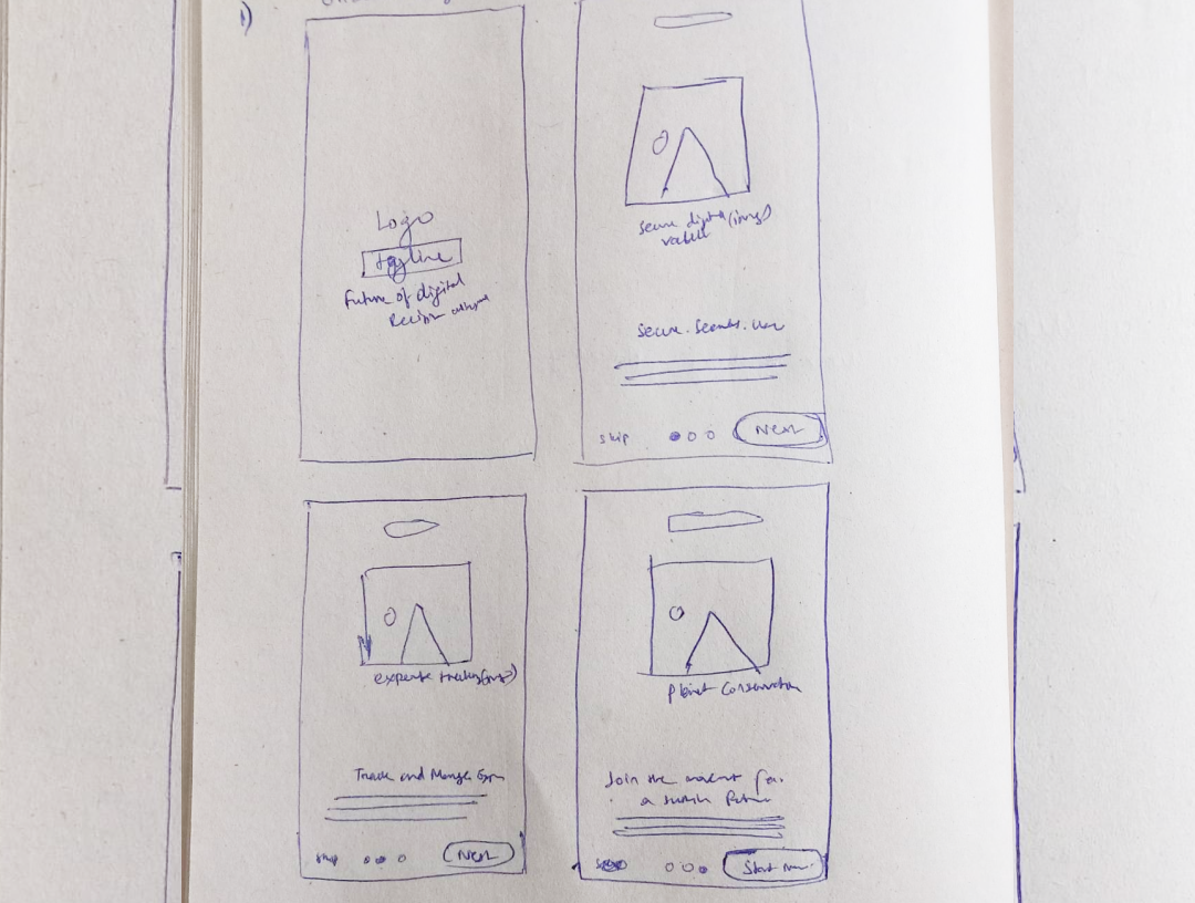
Onboarding screen sketches
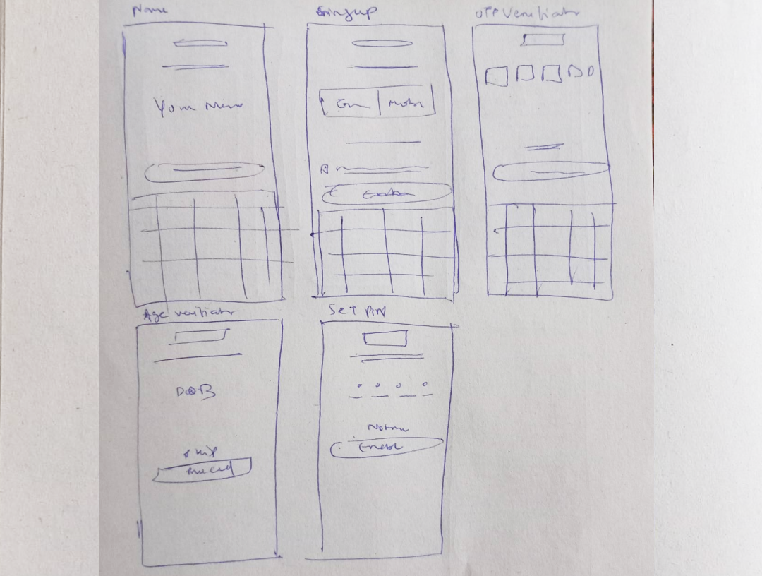
Sign up screen sketches
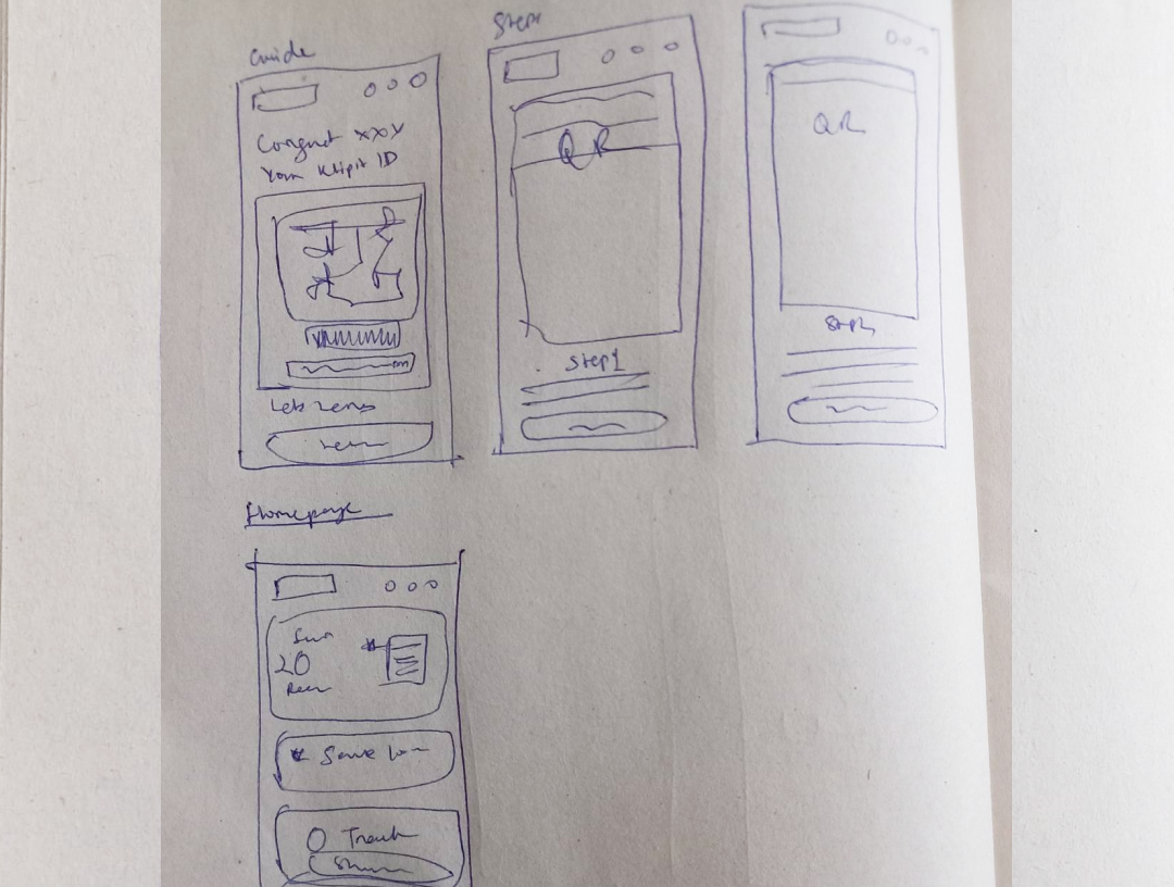
Guide and Home screen sketches
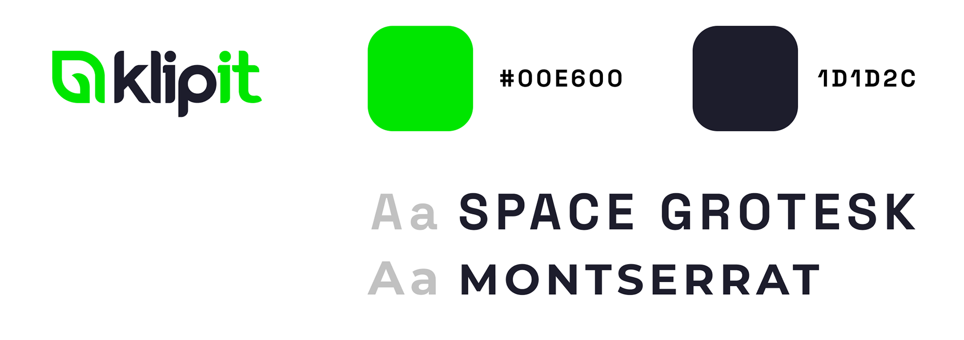
Typeface and color scheme
As per the Brand identity and App interface, the same typeface and color scheme were evenly followed throughout the project.
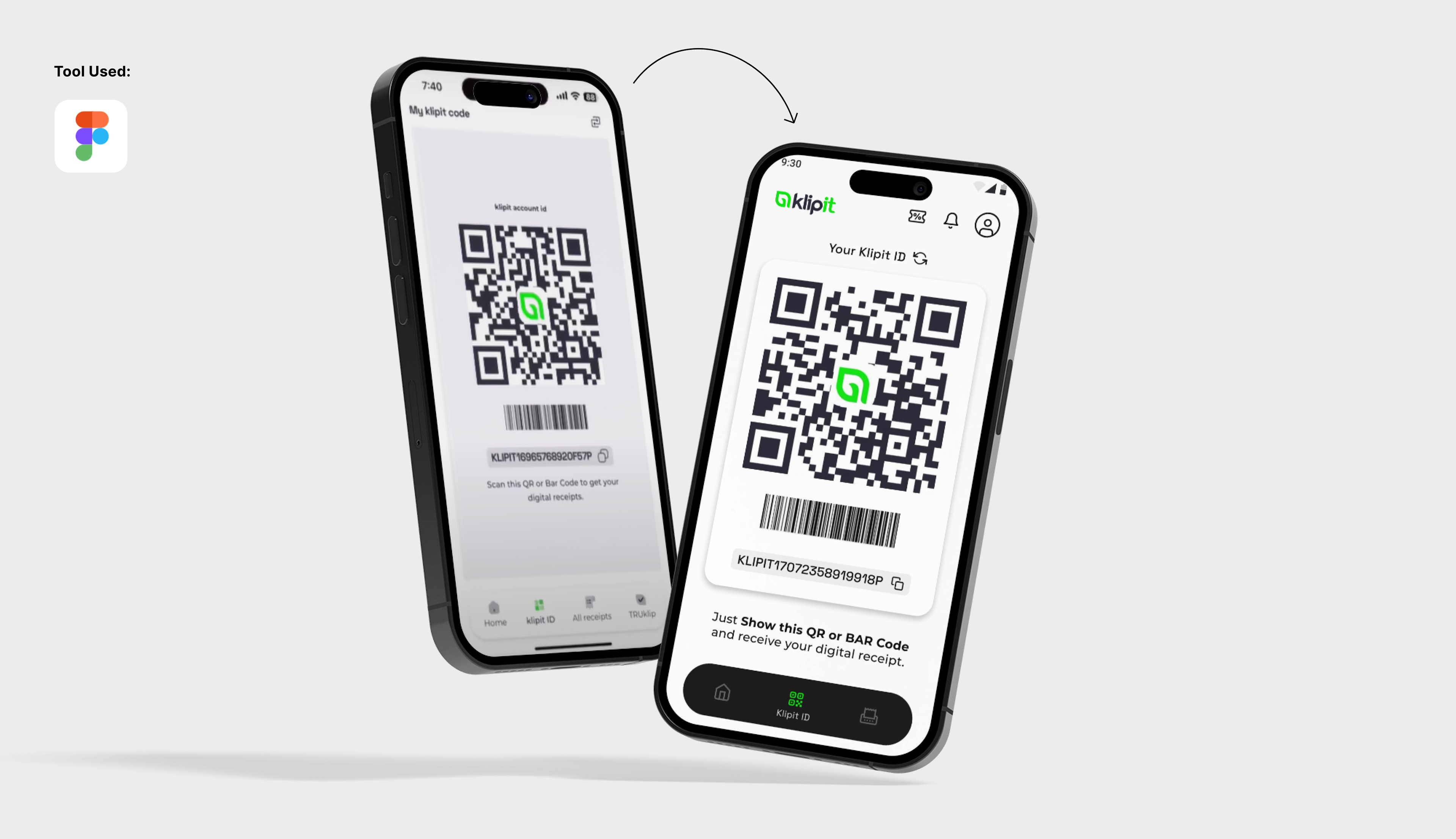
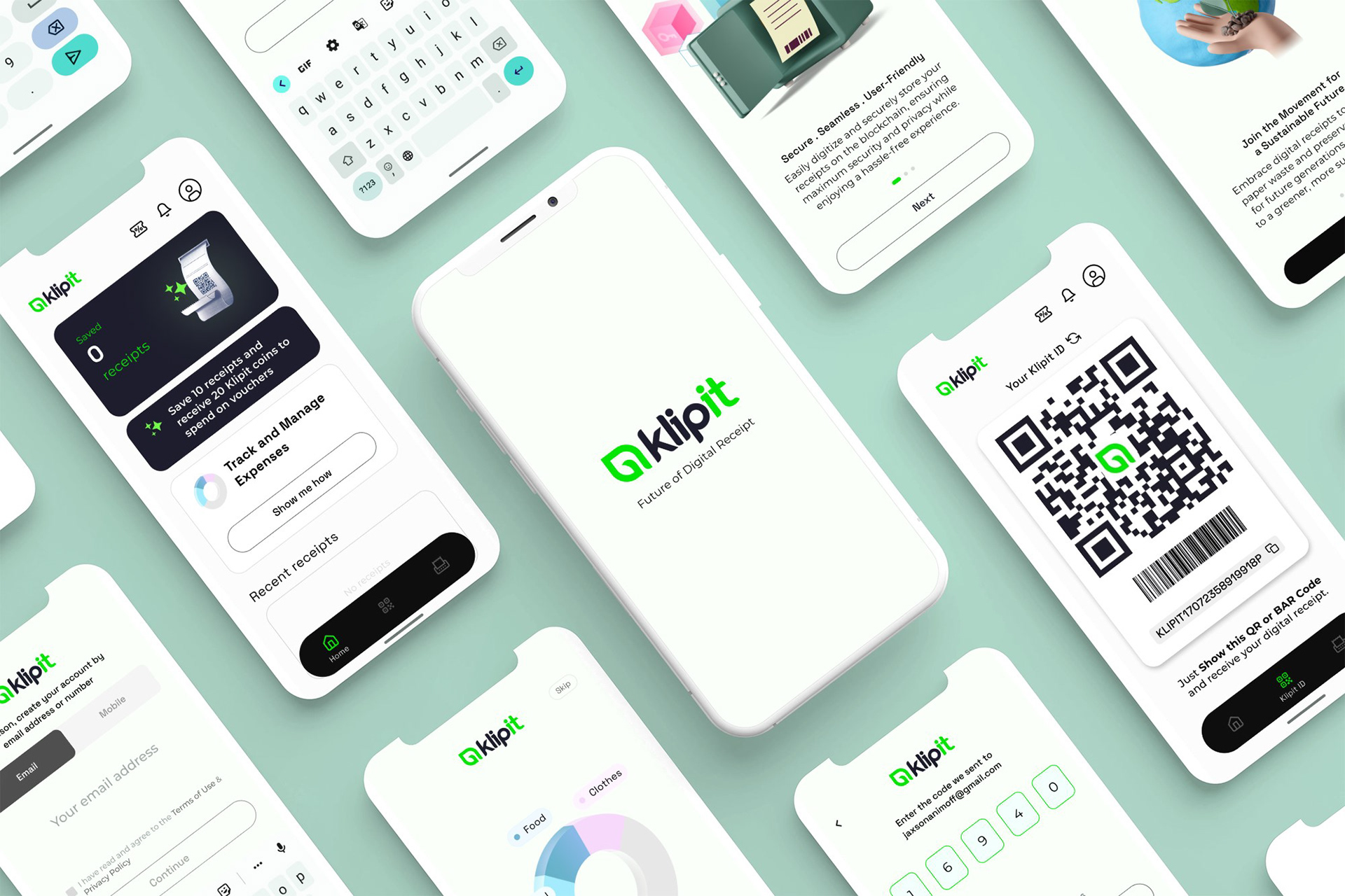
High fidelity wireframes
• Design principles
The visual composition of all the elements on the screen was improved using design principles. This helped in balancing the visual weight and defining the hierarchy of the elements.
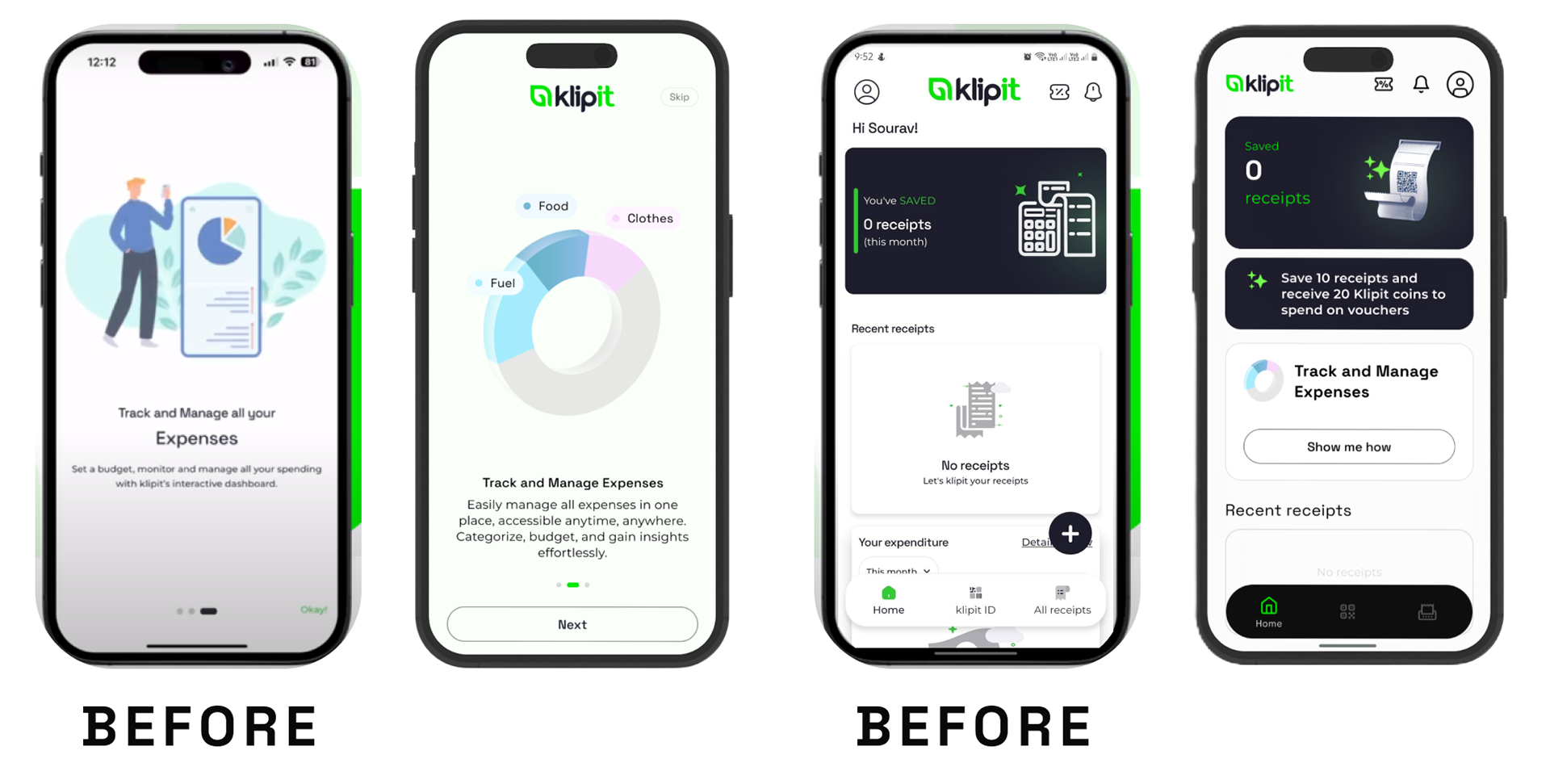
• Tagline
Devised a simple, crisp, and effective tagline under the brand logo which helped in conveying the purpose of the brand.
• Graphic illustrations
Composed suitable graphic illustrations as per the information. Simplified them to reduce clutter and confusion, hence improving relevance and understanding.
• Improved typography/alignment/hierarchy
Enhanced the typographic layout by organizing the given content neatly. This included adjusting the spacing and alignment of the content and hence creating a visual hierarchy for the viewers.
• Buttons and Icons redesigned
Modified the existing buttons to follow the overall visual language. Designed a hierarchy of primary and secondary buttons. Furthermore, simplified the icons for better understanding.
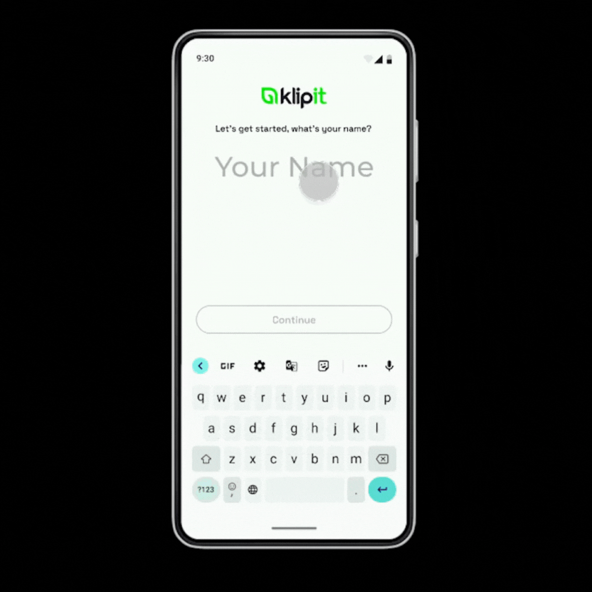
• More engaging user flow
Improved the user flow for a more personalized connect, which would be self-explanatory and hassle-free.
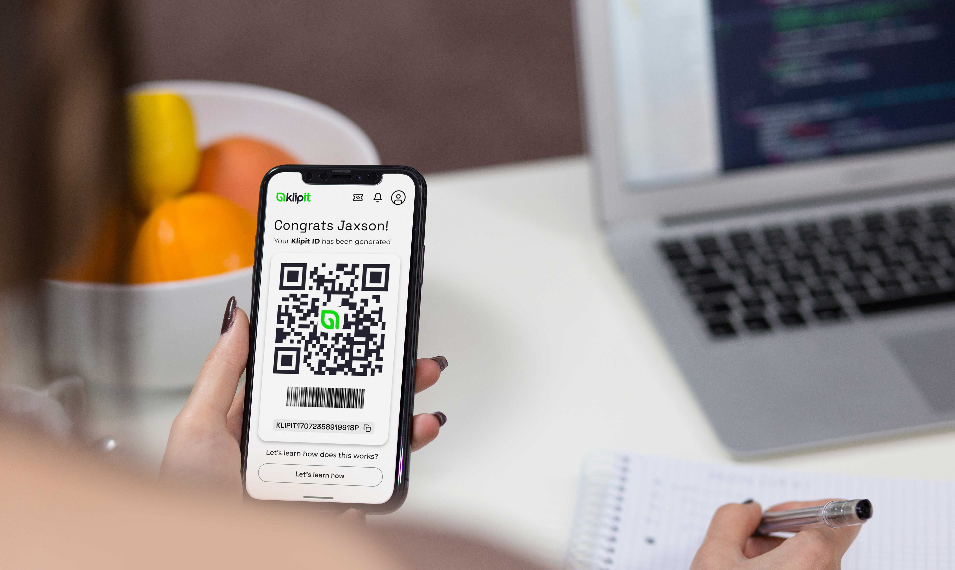
• Confirmation of profile generation
Designed a screen for confirmation of successfully creating a user profile. This creates a sense of satisfaction in the users' minds which helps in earning their trust.
• Guiding steps
Designed screens displaying the steps of functioning of the App, which serves as a guide for new users.
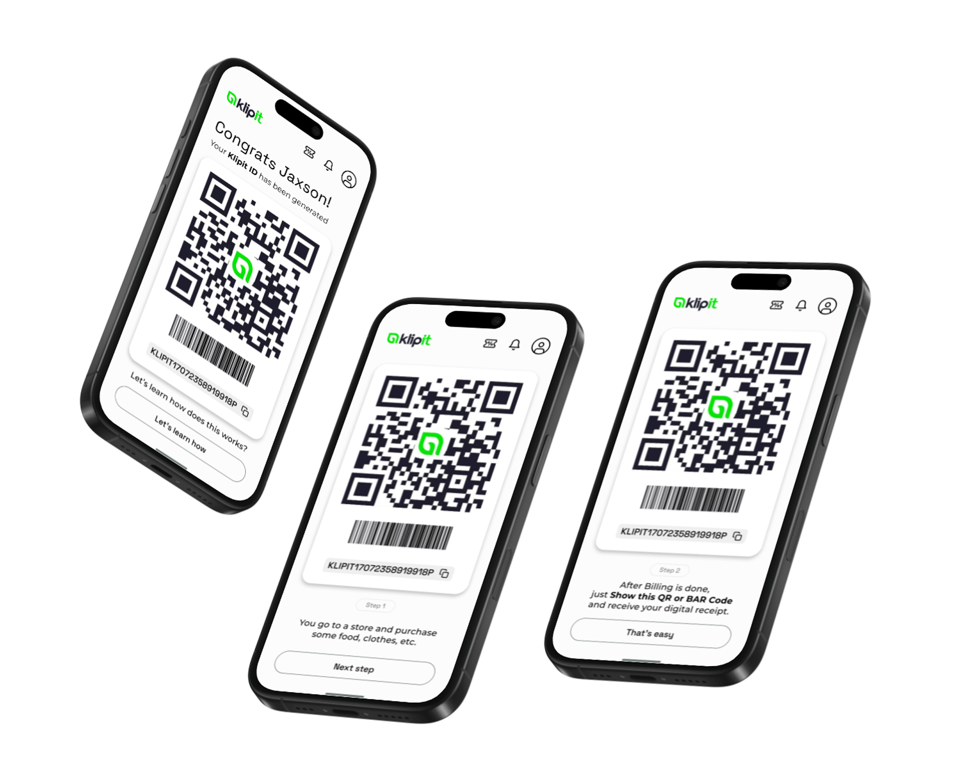
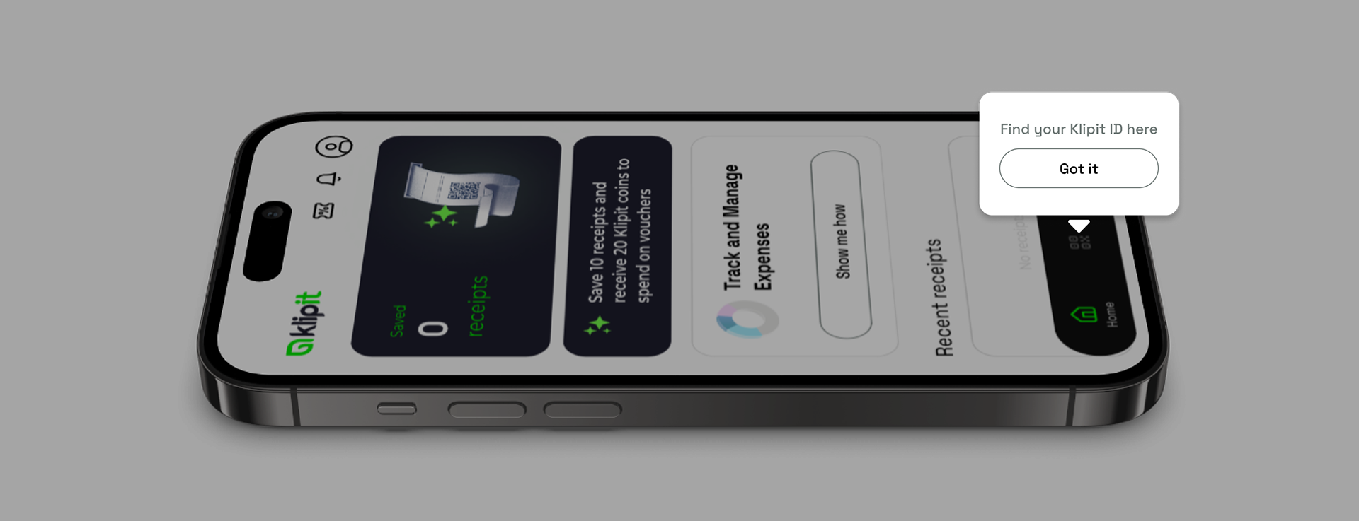
• Designed tooltips
Devised tooltips to get new users acquainted with the features of the App, and help them navigate through the App seamlessly.
Conclusion
>> Core insights from the project
• Creating a highly personalized onboarding experience for the user
• Providing users with a digital experience that imitates a physical guide
>> Key takeaways applicable in every UI/UX project
• The usage of simple words is the key to understanding the digital product better.
• Simplified visual representation minimizes the users' need to think for understanding the product and its information.
Thank you for your valuable time.